
DESIGNING FROM WITHIN
What the Desert Taught Me About Color
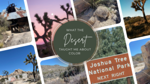
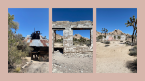
There’s a trail in Joshua Tree that takes you past the ruins of an old homestead and what’s left of a mine.
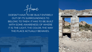
Not much is standing. A concrete pad. White brick, sun-bleached. A few beams that have given up. And a brick fireplace, still upright, still holding its shape while everything around it has quietly come apart.
Here’s what struck me. The brick and the concrete didn’t come from out there. Somebody hauled all of it into the middle of the desert, on purpose, because they had decided this was going to be home.
That’s a remarkable thing to decide. The desert gives you almost nothing easily. And they looked at it anyway and thought: yes, here.
I stood there with my husband and went quiet for a second longer than normal. The house is gone. The hearth is still there.
I think about that trail more than I expected to.
Everyone Says Beige
Say “desert” to most people and they picture beige. Sand, tan, maybe a dusty terracotta if they’re feeling generous.
I knew better in theory. But there’s a real difference between knowing a landscape has color in it and spending enough time in one to actually watch it happen.
During the pandemic, Joshua Tree became our place. My husband knew it long before I did, and he introduced it to me with a kind of quiet reverence that made me pay closer attention than I might have otherwise. We’d drive out every few weeks to hike, to stargaze, to breathe air that hadn’t come through a vent.
What all that time gave me was range.
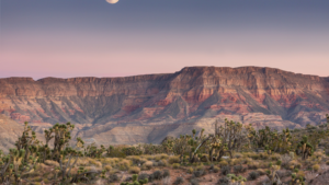
The same rocks are bleached and silver-pale in the early morning. By mid-morning the sand has warmed to gold and the shadows have gone a cool, chalky lavender. Then golden hour arrives, and Joshua Tree golden hours are something close to religious. Everything turns ochre and rust and copper under a sky moving through pink, coral, violet. By night it’s charcoal and blue-black under more stars than most of us are ever allowed to see.
Same landscape. Four completely different color stories, all in one day.
So I’d ask you to try something. Stop filing the desert under neutrals. It isn’t a neutral. It’s a full spectrum that happens to hold still long enough for you to miss it.
The Colors Nobody Photographs
The other surprise is how alive it is. Everyone assumes sparse and empty. Slow down for ten minutes and it’s teeming.
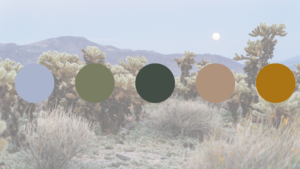
Sage and creosote give you dusty greens and grey-greens that have no equivalent in a paint deck. Prickly pear pads glow blue-green. Ocotillo blooms are a red so saturated it reads like an accent wall the desert installed itself. And in spring the floor erupts with wildflowers in yellow, purple, and vivid pink against all that muted earth.
These are not the colors people bring home from Joshua Tree. They should be.
They Found Home Here
Back to that homestead.
What I keep returning to isn’t the beauty of the ruins. It’s the decision behind them. Somebody chose an unlikely place, brought in what the place couldn’t provide, and let the rest of it be shaped by where they were.
That’s not a bad description of good design, honestly.
A home doesn’t have to be built entirely out of its surroundings to belong to them. It has to be built with some awareness of where it is: the light, the color, the way the place actually behaves. Materials that are honest about what they are. Color that comes from somewhere real rather than a trend forecast. Rooms that feel settled instead of provisional.
A home that knows what it is. That’s the thing I keep reaching for.
How to Bring It Home Without Making It a Theme
The most common mistake is picking one color and calling it done. A terracotta wall. A beige sofa. A sandy rug. Each one fine. Together, somehow, flat.
The desert doesn’t work that way. It layers. Warm and cool at once, light and shadow always in the room, and then something unexpected sitting against all that quiet. Range and tension. That’s the difference between a room that feels alive and a room that’s merely tasteful.
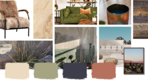
When I build a desert palette for a home, I’m working in three registers. Warm neutrals to ground it. Earthy mids for depth. And then the contrast moments that keep it from being predictable: a deep charcoal, a dusty lavender, a note of rust or mineral green.
Texture does at least half the work. The same palette reads completely differently in smooth plaster than in rough adobe, in polished concrete than in raw stone. Color is only ever part of the story.
The desert is just the beginning. In this series we’ll keep exploring the natural world as a source of palette, feeling, and design philosophy, because nature has always been the most honest designer of all.
But for now, if you take one thing from this: the desert is not beige. It never was.
It just requires someone to slow down long enough to see it.
Designing From Within is an ongoing series exploring the sensory, intuitive, and emotional layers of how we experience our homes.